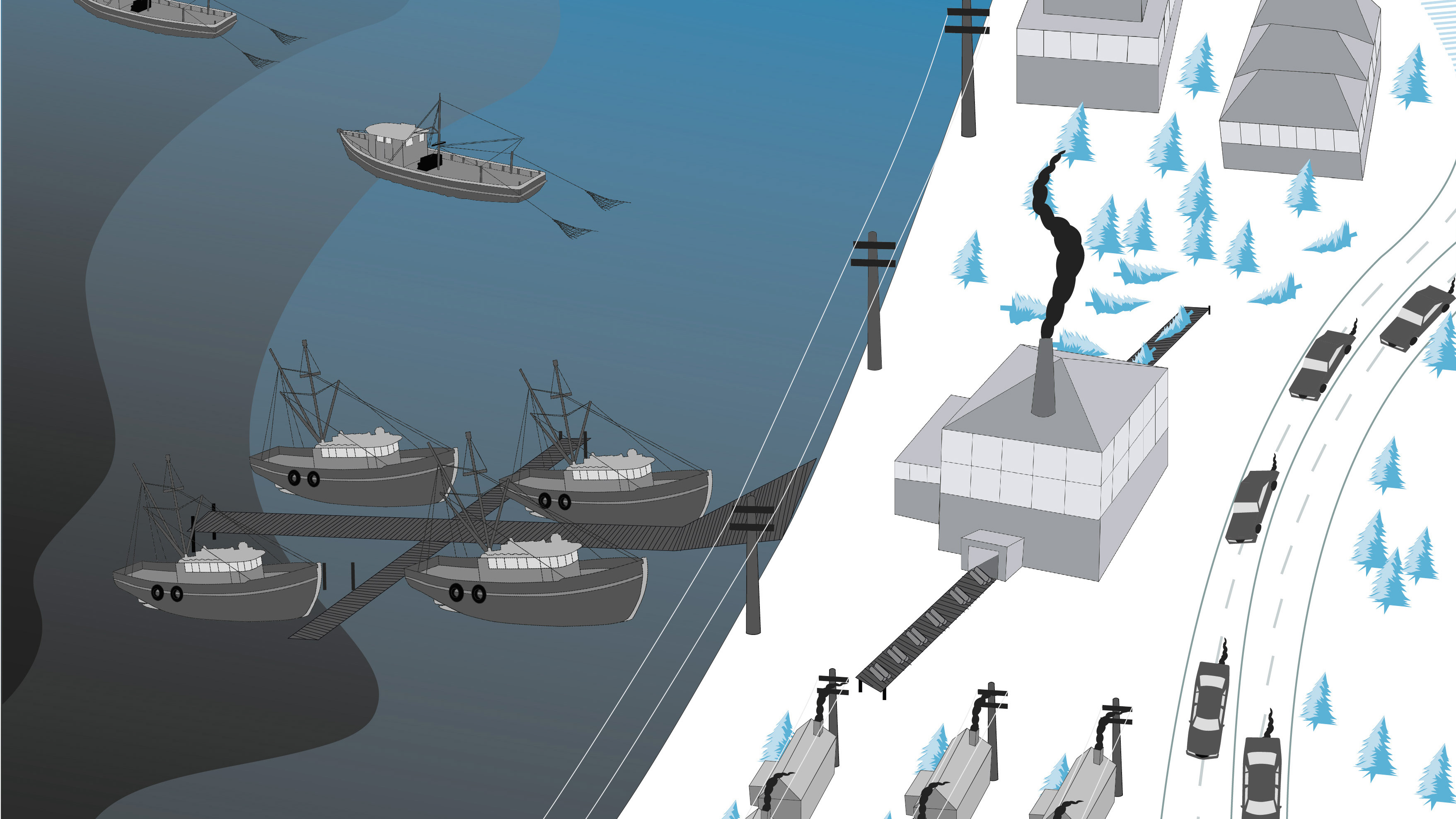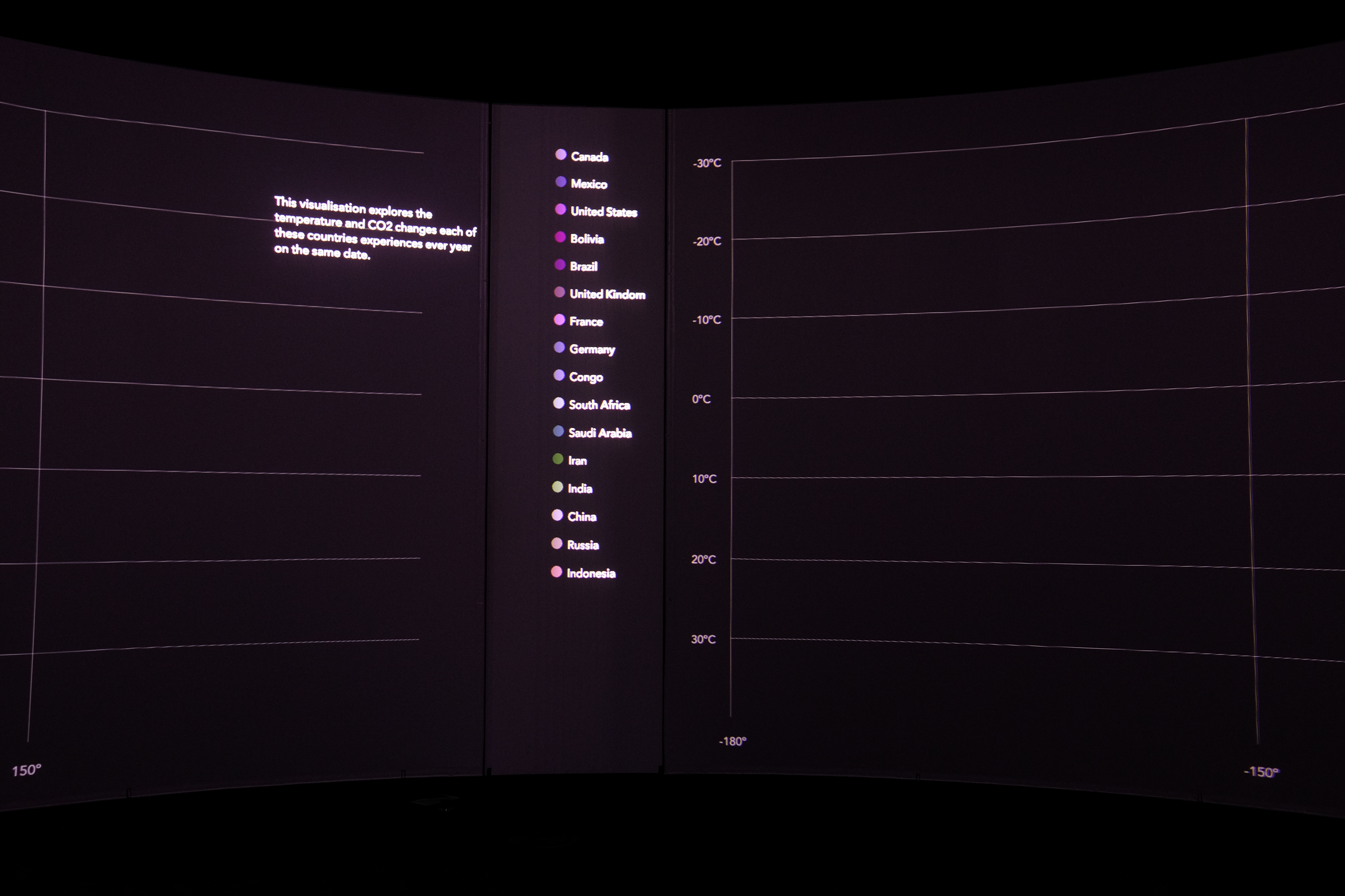
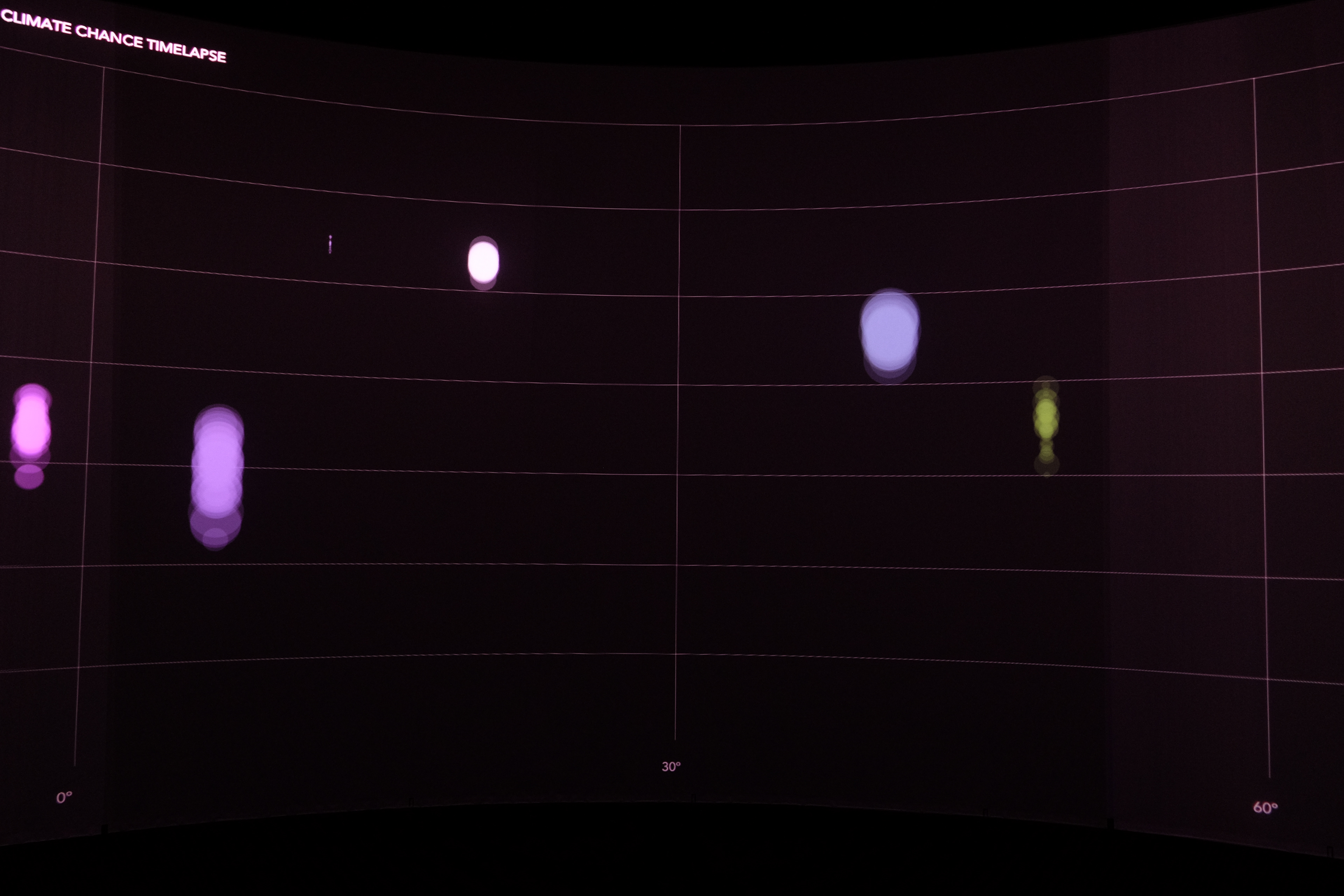
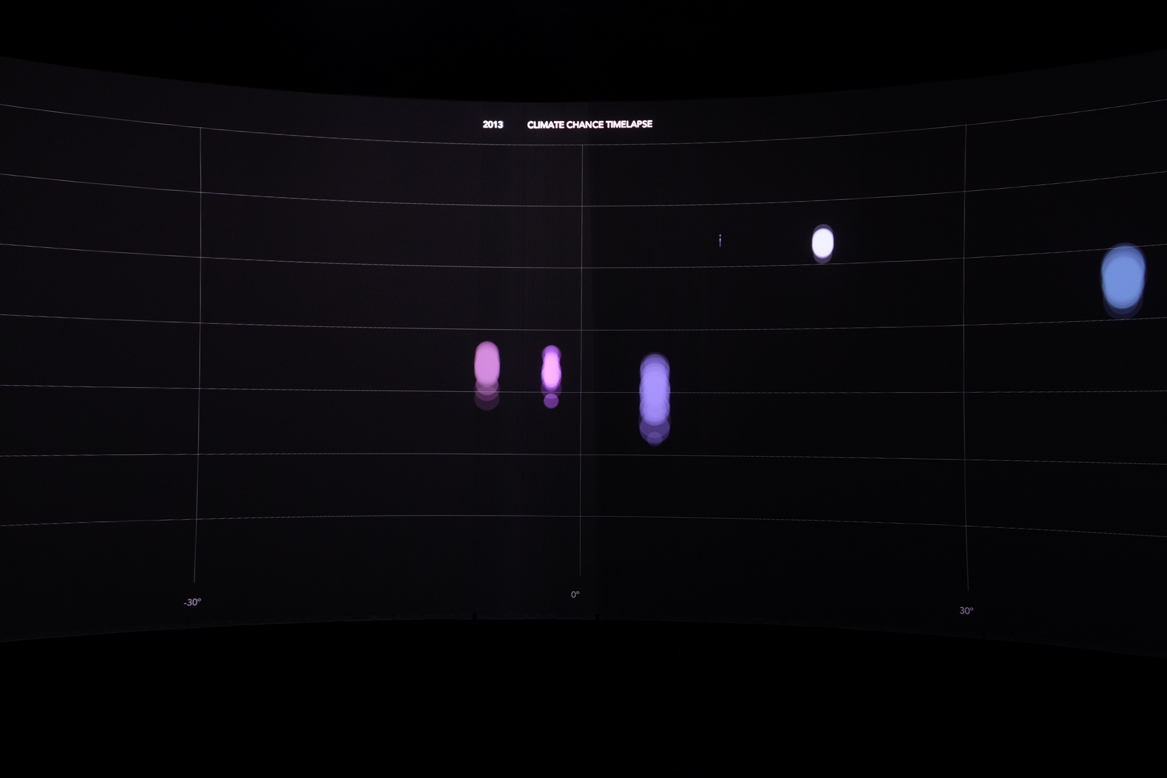
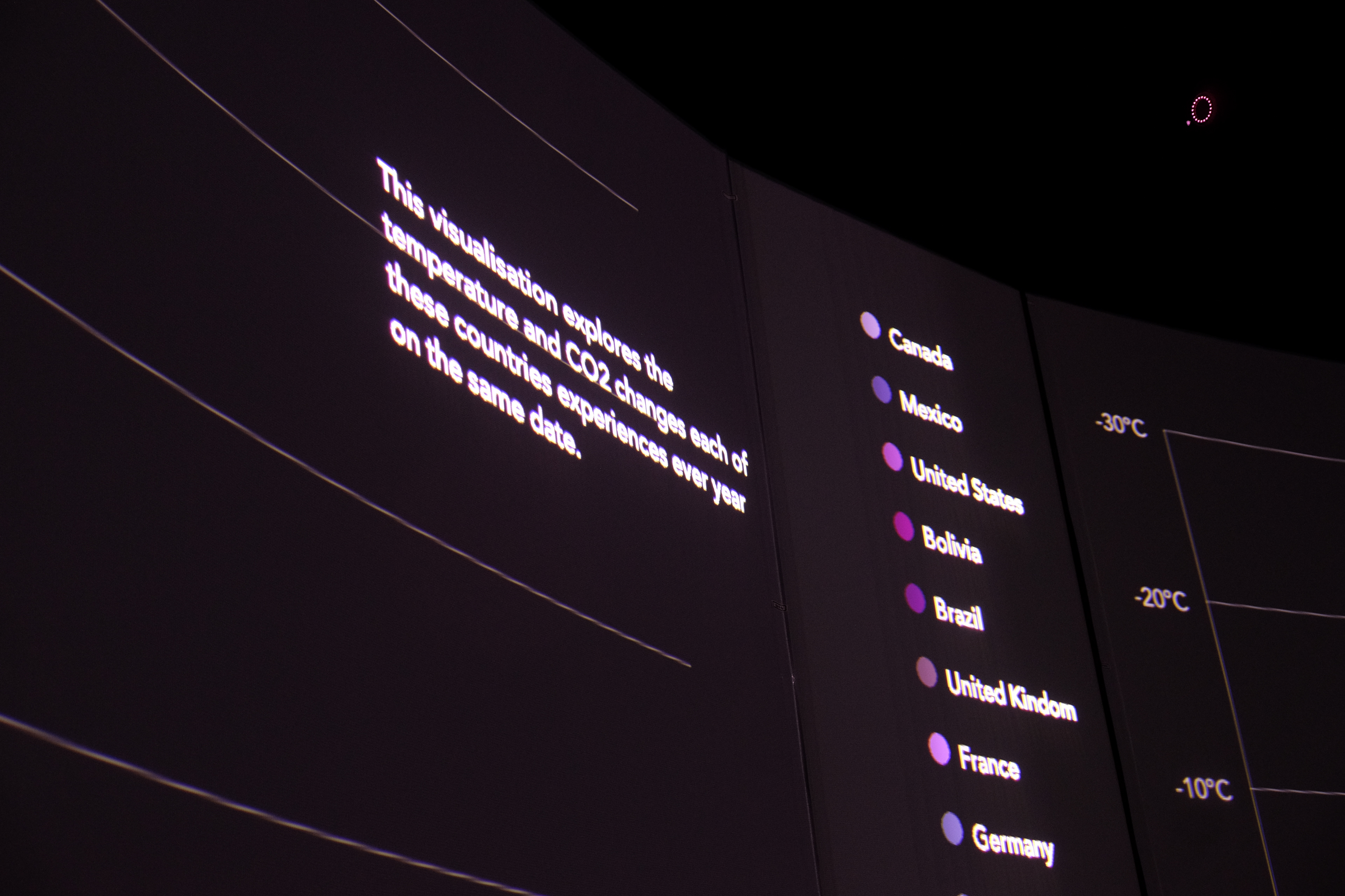

This coding project was created with the P5 language. I wanted to visualise climate change through a time-lapse of fluctuating global temperatures. I visualised each country with different colours and used raw data of each country's annual temperature starting 1960 to present, I was able to move each country vertically up or down depending on changing temperatures. Using this and data of country CO2 emissions p.a, which would expand or decrease the circles size if increased or decreased, I was able to visualise the direct correlation between CO2 emissions and climate change.