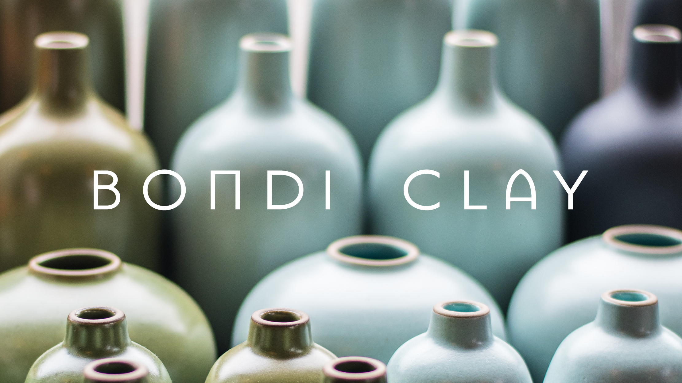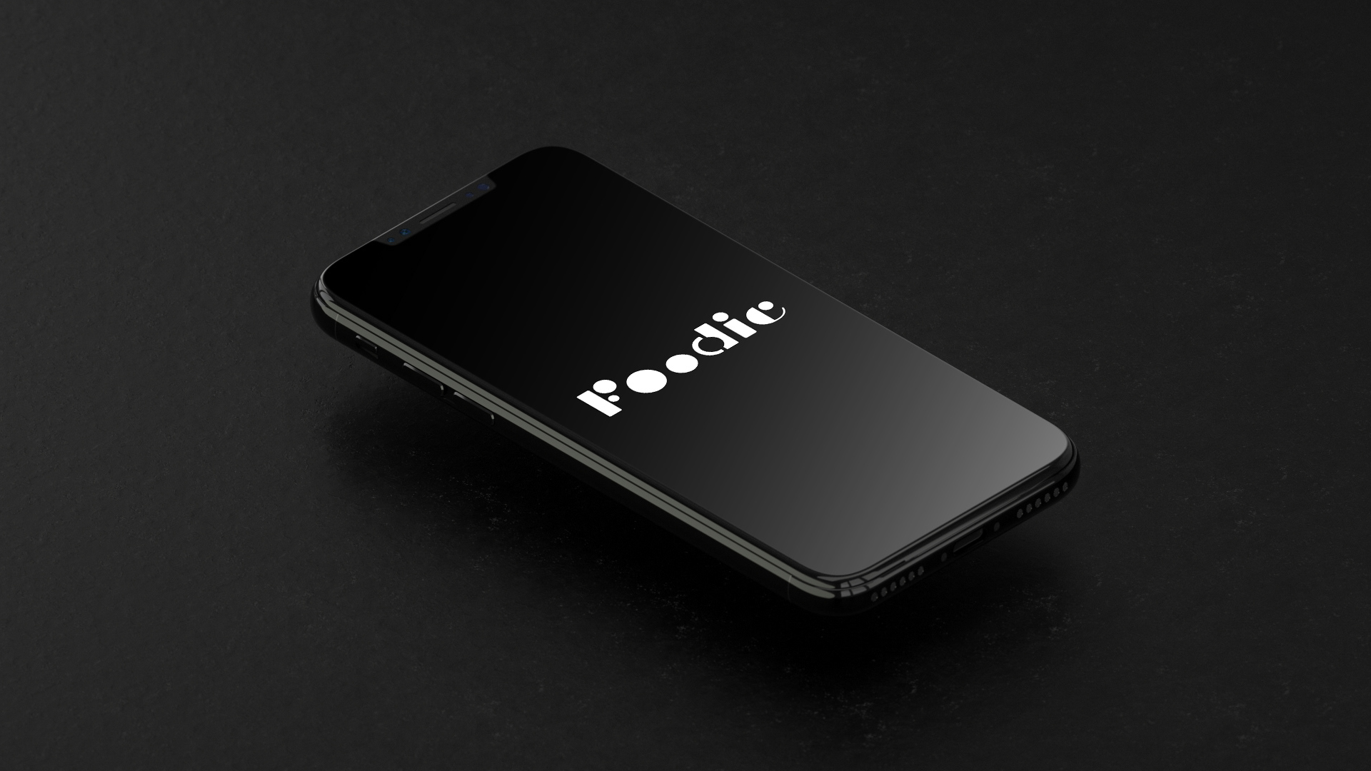
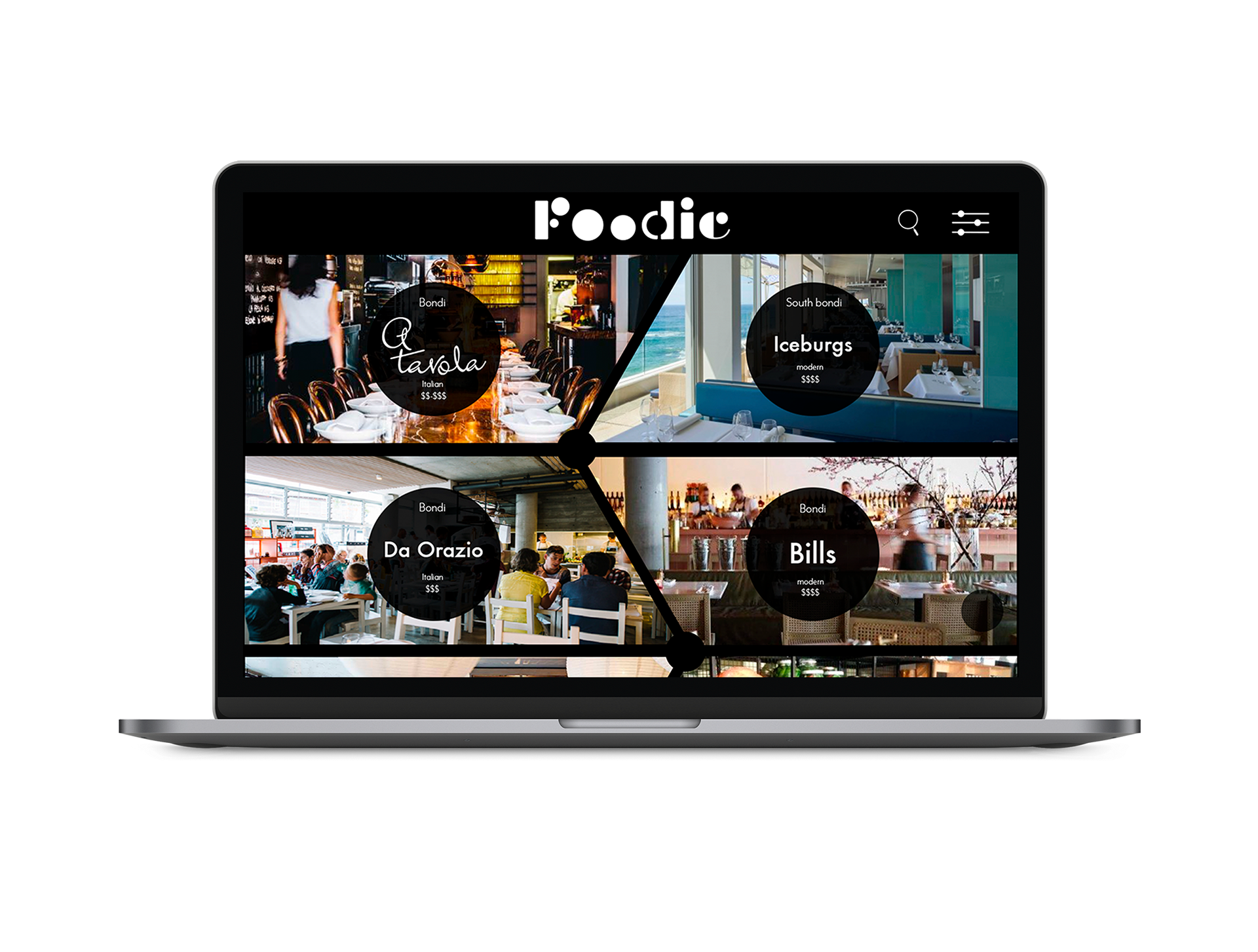
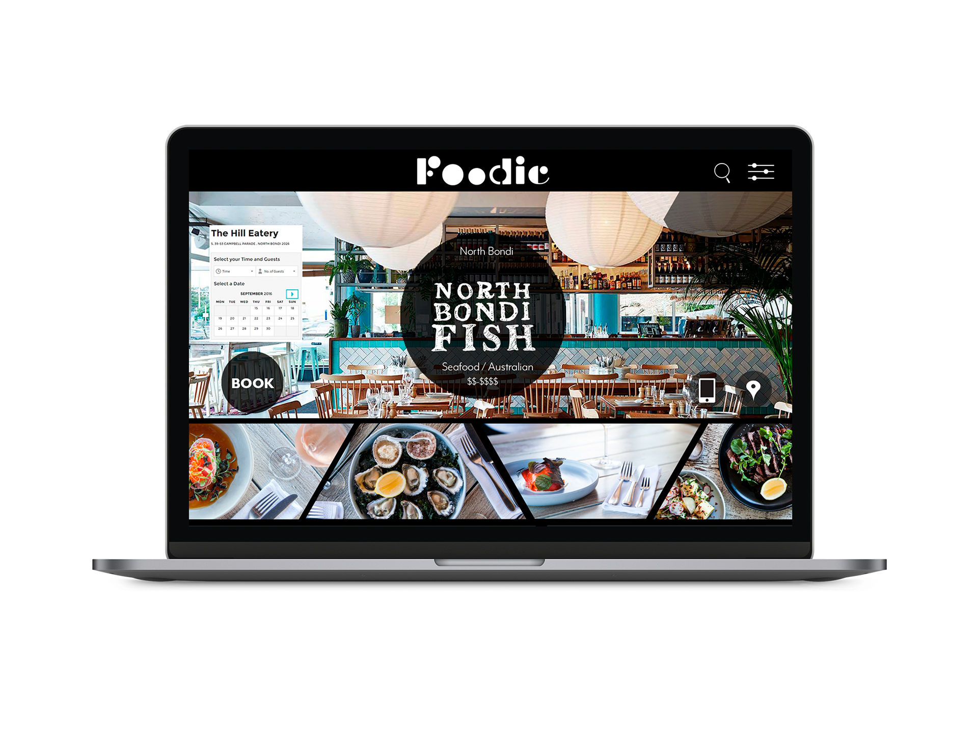

This self initiated business venture, was design to be an all in one restaurant booking, paying and reviewing platform. When designing the brand and logo, I wanted to create something that was interesting to look at, yet still user friendly enough to make the audience engage with the platform. I created my own typeface for the logo, using bold geometric circles to form the letters. The concept behind this was to make reference to plates and bowls on a busy restaurant table. The use of the rounded letter forms also can be linked to the emotion we get when thinking of comfort food.